Exploring dashboards
Kibana dashboards support filtering, time range adjustments, and interactive controls that let you focus on specific data segments or time periods. Use these interactive features to drill into your data, compare metrics across different dimensions, and uncover insights that matter to your analysis.
This page covers the main ways to explore dashboard data: using Kibana Query Language (KQL) queries, filter pills, time ranges, and dashboard controls. You'll also learn how to view underlying data and switch between different display modes.
Kibana supports several ways to explore the data displayed in a dashboard more in depth:
- The query bar, using KQL expressions by default.
- The time range, that allows you to display data only for the period that you want to focus on. You can set a global time range for the entire dashboard, or specify a custom time range for each panel.
- Controls, that dashboard creators can add to help viewers filter on specific values.
- Filter pills, that you can add and combine by clicking on specific parts of the dashboard visualizations, or by defining conditions manually from the filter editor. The filter editor is a good alternative if you’re not comfortable with using KQL expressions in the main query bar.
- View the data of a panel and the requests used to build it.
This section shows the most common ways for you to filter dashboard data. For more information about Kibana and Elasticsearch filtering capabilities, refer to Querying and filtering.
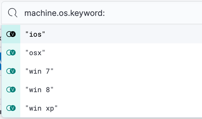
The query bar lets you build filters using Kibana Query Language (KQL). When typing, it dynamically suggests matching fields, operators, and values to help you get the exact results that you want.
You can use KQL to create complex queries that filter your dashboard data. For example:
status:errorto show only error recordsresponse_time > 1000to display requests slower than 1 seconduser.name:"john doe" AND status:activeto combine multiple conditions
When working with large datasets, complex KQL queries might cause dashboards to load slowly. In versions 9.2 and later, you can send long-running searches to the background and continue working on other tasks while the data loads.
Use filter pills to focus in on the specific data you want.

You can interact with some panel visualizations to explore specific data more in depth. Upon clicking, filter pills are added and applied to the entire dashboard, so that surrounding panels and visualizations also reflect your browsing.
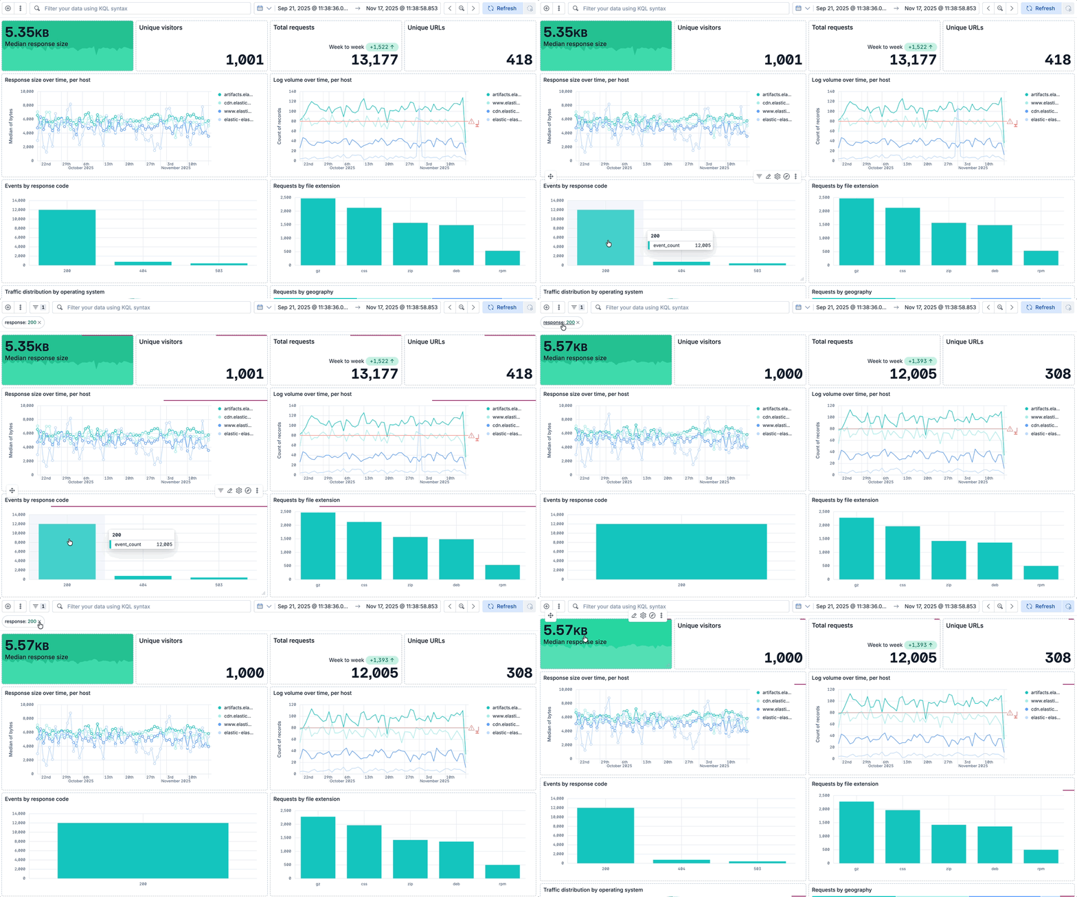
You can create filter pills by:
- Clicking on chart elements, such as data points, bars, or slices.
- Using legend actions: hover over a legend item and select Filter In or Filter Out to filter the dashboard by a specific series.
ES|QL-based visualizations and Discover sessions imported to a dashboard also support interactive filtering. This works for fields that exist in the underlying Elasticsearch indices. Computed fields created with ES|QL commands like EVAL do not support filtering.
As an alternative to the main query bar, you can filter dashboard data by defining individual conditions on specific fields and values, and by combining these conditions together in a filter pill.
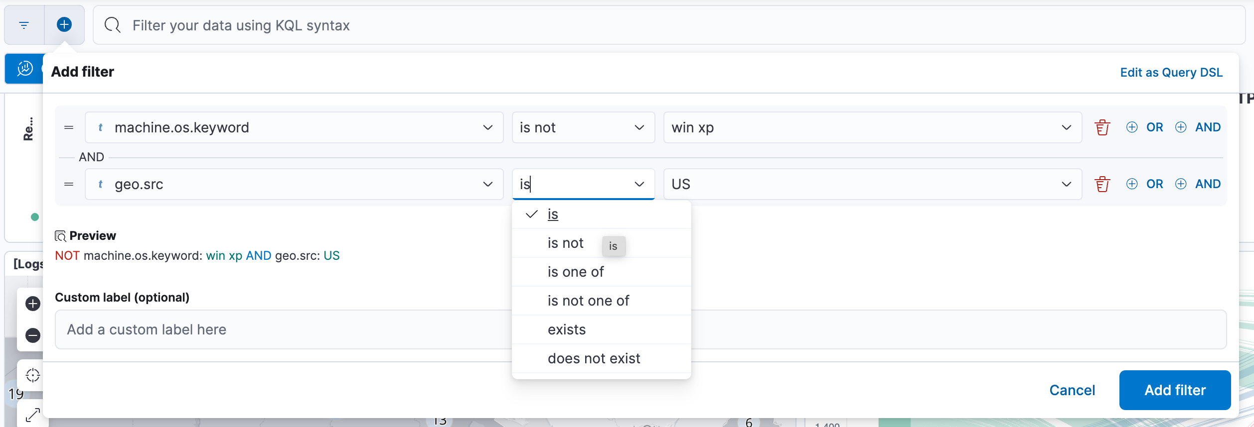
You can interact with filter pills to edit them, temporarily alter their behavior without having to remove them, or make them available in other contexts. The following options are available when selecting a filter pill:
- Pin across all apps and Unpin
-
Adds this filter to available dashboards and to apps such as Discover, Lens, Maps, and Visualize. You remove the filter if you:
- Unpin it. In this case, the filter only remains on the currently open app, unpinned.
- Remove it from any place while it's still pinned.
- Refresh your session, for example by opening a dashboard in a new tab. Pinned filters are not saved along with the dashboard, visualization, or Discover session that you added them to.
TipWhen a pinned filter can't be applied, for example if a field specified in the filter doesn't exist in the current data view, the filter is ignored and shows in a different color.
- Edit filter
- Lets you edit and update the filter.
- Exclude results and Include results
- Reverses the filter behavior.
- Temporarily disable and Re-enable
- Lets you temporarily deactivate a filter instead of requiring you to remove it. This is particularly useful for testing different filter combinations.
- Delete
- Removes the filter.
You can perform most of these actions at once for all filters in your current view using the Query menu. From that menu, select Apply to all, then choose the action you'd like to perform.
The query bar lets you build filters using Kibana Query Language (KQL). When typing, it dynamically suggests matching fields, operators, and values to help you get the exact results that you want.
The data visible in a dashboard highly depends on the time range that is applied. In a dashboard, you can select a time range that applies globally to all panels, or set a custom time range for specific panels.
The global time range menu is located right next to the query bar, in the dashboard’s header. With this menu, you can select the time range to apply, and set the frequency for refreshing the dashboard data. Setting the time range is a common action in Kibana. Refer to Set the time range for more details.
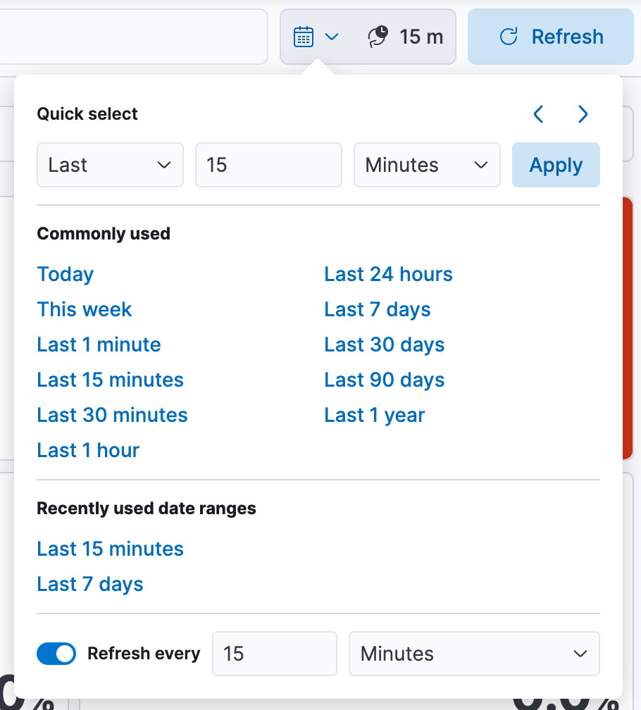
To apply a panel-level time range:
- Hover over the panel and click
 . The Settings flyout appears.
 - Turn on Apply a custom time range.
- Enter the time range you want to view, then click Apply.
To view and edit the time range applied to a specific panel:
When a custom time range is active for a single panel, it is indicated in the panel’s header.
To edit it, click the filter. You can then adjust and apply the updated Time range.
Dashboard authors can add various types of additional controls to help you filter the data that you want to visualize.
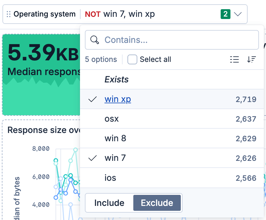
Filter the data with one or more options that you select.
Open the Options list dropdown.
Select the available options.
Selecting Exists returns all documents that contain an indexed value for the field.
Select how to filter the options.
- To display only the data for the options you selected, select Include.
- To exclude the data for the options you selected, select Exclude.
To clear the selections, click
 .
.To display only the options you selected in the dropdown, click
 .
.
For IP address type fields, you can use CIDR notation (for example, 192.168.1.0/24) to filter by IP ranges.
Filter the data within a specified range of values.
On the Range slider, click a value.
Move the sliders to specify the values you want to display.
The dashboard displays only the data for the range of values you specified.
To clear the specified values, click
 .
.

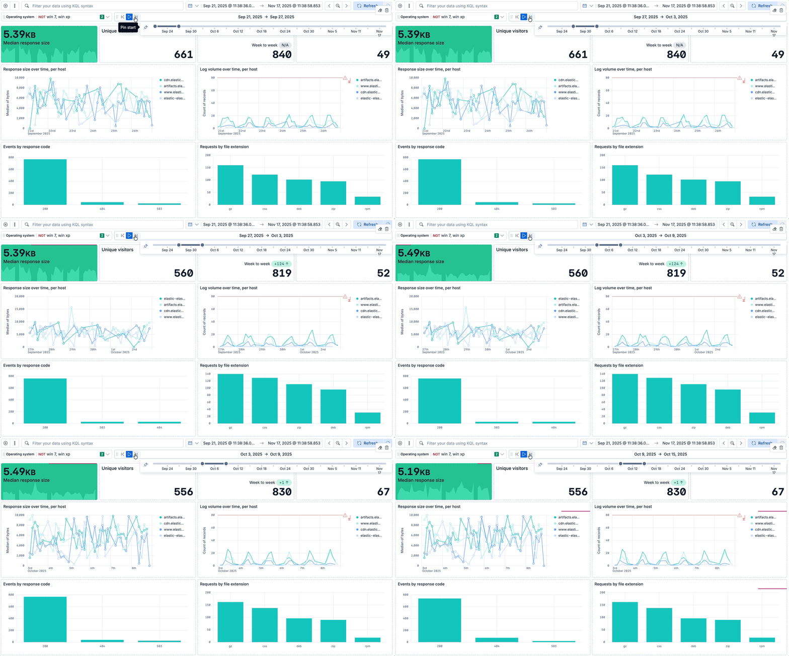
Filter the data within a specified range of time.
- To view a different time range, click the time slider, then move the sliders to specify the time range you want to display.
- To advance the time range forward, click
 .
. - To advance the time range backward, click
 .
. - To animate the data changes over time, click
 .
. - To clear the specified values, click
 .
.
Viewing the details of all requests used to build a visualization and the resulting data helps you confirm that the visualization is showing the right data and that the requests are performing as expected.
The available actions can vary depending on the panel you're inspecting.
This action is possible for all charts created using Lens or ES|QL. It is not available for other types of panels, such as Maps or Vega visualizations.
Open the panel menu and select Inspect.
Open the View dropdown, then select Data.
If you'd like to download the data, select Download CSV, then select the format type from the dropdown:
Formatted CSV: Contains human-readable dates and numbers.
Raw CSV: Formatted for computer use.
When you download a visualization panel with multiple layers, each layer produces a CSV file, and the file names contain the visualization and layer data view names.
The request Inspector is available in Discover and for all Dashboards visualization panels that are built from a query. The available information can differ based on the request.
- Open the Inspector:
- If you're in Discover:
-
Hover over the active tab and select the Actions icon, then select Inspect. -
Select Inspect from the application menu.
-
- If you're in Dashboards, open the panel menu and select Inspect.
- If you're in Discover:
- Open the View dropdown, then select Requests.
- Several tabs with different information can appear, depending on nature of the request:
Tip
Some visualizations rely on several requests. From the dropdown, select the request you want to inspect.
Statistics: Provides general information and statistics about the request. For example, you can check if the number of hits and query time match your expectations. If not, this can indicate an issue with the request used to build the visualization.
Clusters and shards: Lists the Elasticsearch clusters and shards queried to fetch the data, including for cross-cluster search and cross-project search queries. Use this tab to verify that the request ran correctly.
NoteThis tab is not available for Vega visualizations.
Request: Provides a full view of the visualization's request, which you can copy or Open in Console to refine, if needed.
Response: Provides a full view of the response returned by the request.
When a custom time range is active for a single panel, it is indicated in the panel’s header.
You can view it in more detail and edit it by clicking the filter.
When viewing a dashboard with read-only permissions, certain visualization panels allow you to view how the visualization itself is configured, and to temporarily edit that configuration.
Hover over a visualization panel and select Show visualization configuration. The Configuration flyout appears.
If this option isn't available, it means one of two things:
- The visualization panel type doesn't support this option.
- You have Edit permissions for this dashboard. In this case, switch the dashboard to Edit mode. You will then be able to edit the configuration of the visualization for all viewers of the dashboard.
View the configuration of the visualization. You can make edits, but these will be lost as soon as you exit the flyout.
Select Cancel to exit the Configuration flyout.
A dashboard can display data from multiple Serverless projects when cross-project search is enabled. To check and control which projects are queried, use the CPS scope selector in the header. You can change this scope at any time during your session, and all panels update accordingly.
Sometimes, the scope behaves differently:
- The dashboard restores a saved scope on open. Some dashboards are configured to store a cross-project search scope. When you open them, the CPS scope selector is set to the stored scope. You can still change it during your session.
- A panel has a Custom CPS scope badge. This means the panel uses project routing to query a fixed set of projects. It is not affected when you change the dashboard's scope. Select the badge to view which projects the panel queries.
You can display dashboards in full screen mode to gain visual space and view or show visualizations without the rest of the Kibana interface.
To enter full screen mode, make sure the dashboard is in view mode, then open the additional options menu in the application toolbar and select Full screen. Press Escape to exit.
If you need to focus on a particular panel, you can maximize it by opening the panel menu and selecting Maximize. You can minimize it again the same way.
When sharing a dashboard with a link while a panel is in maximized view, the generated link will also open the dashboard on the same maximized panel view.