ES|QL visualizations
You can add ES|QL visualizations to a dashboard directly from queries in Discover, or you can start from a dashboard.
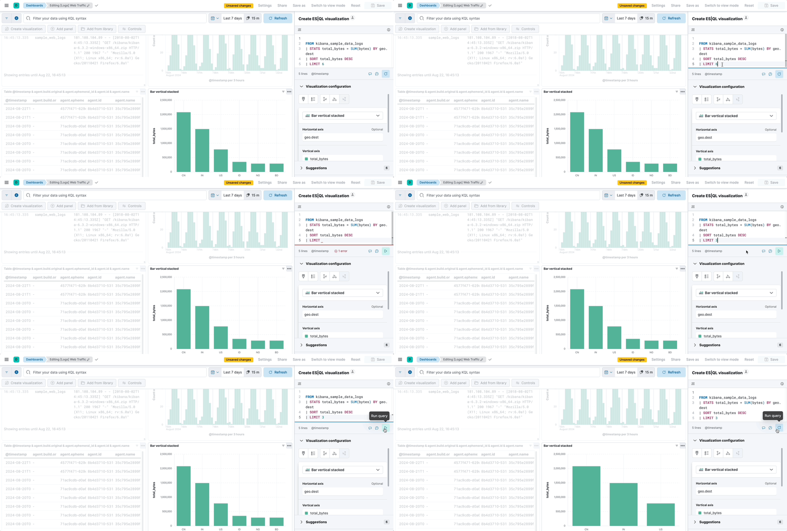
In Discover, typing ES|QL queries automatically shows a visualization. The visualization type depends on the content of the query: histogram, bar charts, etc. You can manually make changes to that visualization and edit its type and display options using the pencil button .
You can then Save and add it to an existing or a new dashboard using the save button of the visualization .
Add a new panel from your dashboard.
-
Select Add > New panel in the toolbar. -
Click Add panel in the dashboard toolbar.
TipIf you haven't created a data view and you don't have a dashboard yet, the Dashboards page offers you the possibility to Try ES|QL right away. By selecting this option, a dashboard is created with an ES|QL visualization that you can interact with and configure using ES|QL.
-
Choose ES|QL under Visualizations. An ES|QL editor appears and lets you configure your query and its associated visualization. The Suggestions panel can help you find alternative ways to configure the visualization.
TipCheck the ES|QL reference to get familiar with the syntax and optimize your query.
When editing your query or its configuration, run the query to update the preview of the visualization.
 Note
NoteWhen you edit the query and run it again, the visualization configuration persists as long as it is compatible with the query changes. Refer to ES|QL visualizations > Chart configuration persistence over ES|QL query update for more details.
You can bind controls to your ES|QL visualizations in dashboards by creating ES|QL controls.
Select Apply and close to save the visualization to the dashboard.
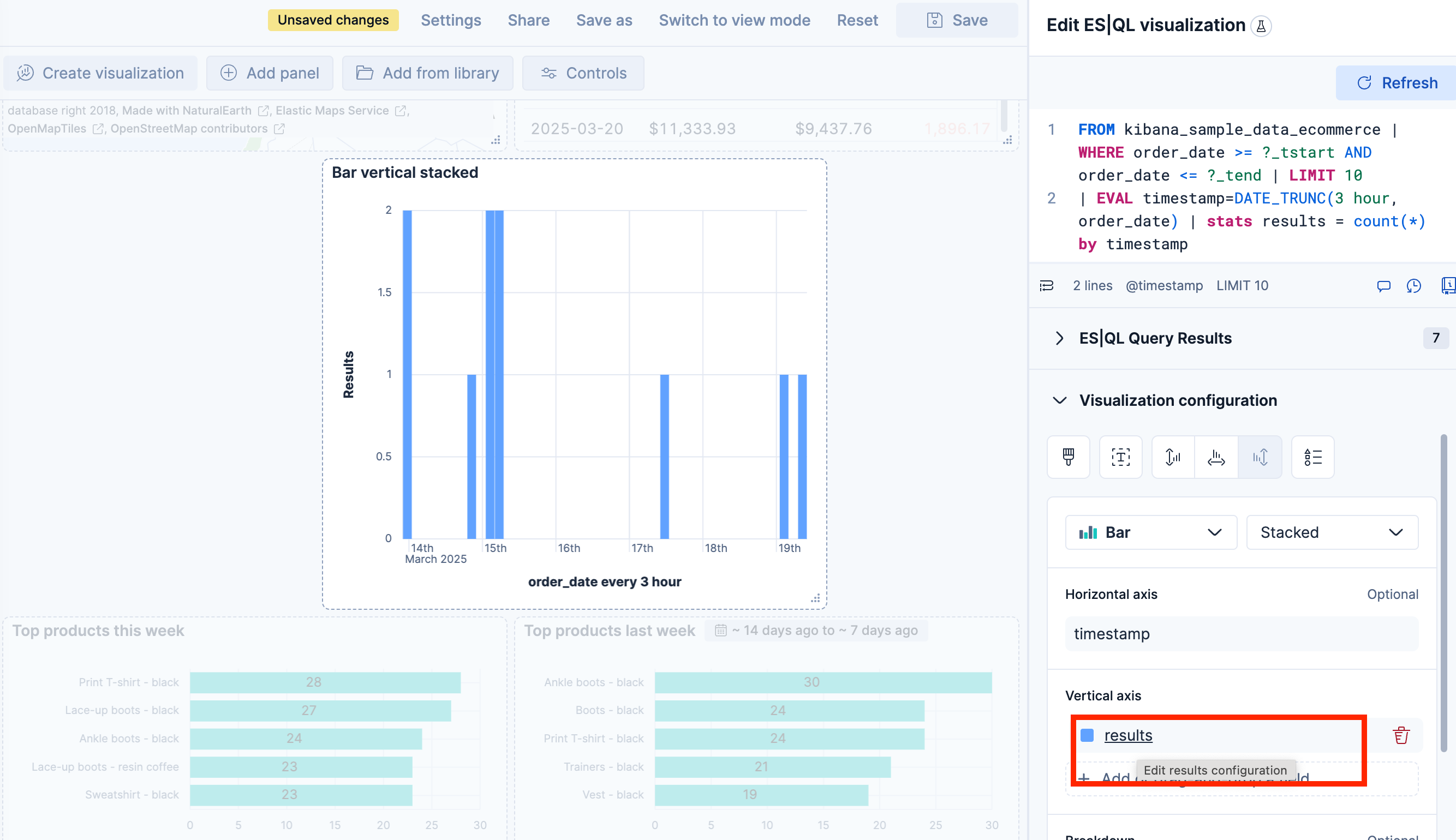
When editing an ES|QL visualization, you can customize the appearance of the chart. To do that:
Click one of the fields representing an axis of the chart to open its details.

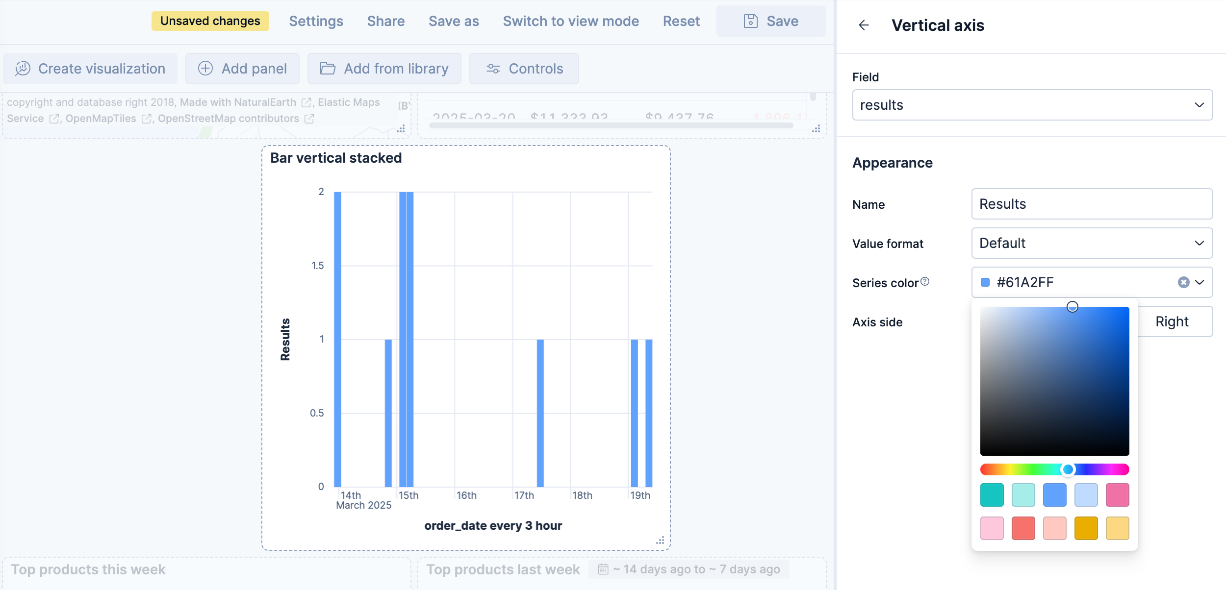
Define the appearance of your choice from the available options.

Return to the previous menu, then Apply and close the configuration to save your changes.
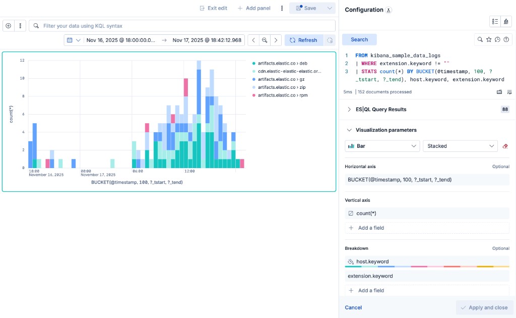
On bar, line, and area charts built from an ES|QL query, the Breakdown dimension can hold more than one field at the same time. Each unique combination of values is rendered as its own series, with the values joined by a › separator in the legend.
When the query groups a metric by more than one field, Kibana places the first field on the Horizontal axis and the remaining fields in the Breakdown dimension. For example, the following query counts web log events over time, broken down by host and file extension:
FROM kibana_sample_data_logs
| WHERE extension.keyword != ""
| STATS count(*) BY BUCKET(@timestamp, 100, ?_tstart, ?_tend), host.keyword, extension.keyword
In the resulting chart, the time buckets are placed on the Horizontal axis, while host.keyword and extension.keyword are combined in the Breakdown dimension. Each legend entry represents a unique combination, such as artifacts.elastic.co › deb or artifacts.elastic.co › gz.

To add another field to the breakdown, select Add a field under Breakdown and choose a column from your query. You can also drag the fields inside the Breakdown dimension to change the order in which their values appear in the combined label.
When you edit the ES|QL query and run it again, the visualization configuration persists as you defined it as long as it is compatible with the query changes.
The chart configuration resets or follows automatic suggestions when:
-
You manually select a different chart type incompatible with the one previously selected. -
You create a new chart and haven't edited the visualization's options yet. - The query changes significantly and no longer returns compatible columns.
When cross-project search is enabled and you have linked projects, your ES|QL visualization queries data based on the current cross-project search scope.
To target specific projects from within the query, add SET project_routing at the beginning of your ES|QL query. When you do this, the visualization panel displays a Custom CPS scope badge on the dashboard, indicating that it uses a different scope than the CPS scope selector. Refer to View data from multiple projects for details.
ES|QL visualizations support dashboard and URL drilldowns. Select a data point in an ES|QL visualization to navigate to another dashboard or an external URL.
Discover drilldowns are not available for ES|QL visualizations.
Once you've created an ES|QL panel, you can create an Elasticsearch threshold rule directly from the visualization panel, based on the data it displays. When you do this, the rule query is automatically generated and either describes the data and sets a specific threshold, or describes the data without setting a specific threshold.
Elastic Security rule types are not supported.
To create a rule with the threshold pre-specified:
- Right-click a data point in the visualization and click Add alert rule. This opens the Create rule flyout. The generated query will define a threshold that corresponds to the data point you selected.
- Configure your Elasticsearch rule.
To create a rule without the threshold pre-specified:
- Open the More actions (three dots) menu in the upper right of the panel and select Add alert rule. This opens the Create rule flyout. The generated query will define a threshold that corresponds to the data point you selected.
- Configure your Elasticsearch rule.
ES|QL query results can include emoji characters, which means you can use them in your ES|QL visualizations. Combined with EVAL and CASE functions, this opens up options like mapping values to colored status indicators (🟢, 🟠, 🔴), adding visual labels, or highlighting specific categories.
This example uses the Kibana sample web logs data to build a status table that shows the success rate per host, with a colored status indicator.

Because they're part of the query results, you can use them in any visualization type that displays text fields, such as bar charts with emoji labels or metric panels with status indicators.
Before you begin, ensure you have the sample web logs data installed. In Kibana, go to Integrations and search for Sample data. On the Sample data page, expand the Other sample data sets section and add Sample web logs.
To create the visualization:
Open a dashboard and add a new ES|QL visualization:
-
Select Add > New panel in the toolbar, then choose ES|QL under Visualizations. -
Click Add panel in the dashboard toolbar, then choose ES|QL.
-
Enter the following query:
FROM kibana_sample_data_logs | EVAL is_success = CASE(response >= "200" AND response < "300", 1, 0) | STATS total_requests = COUNT(*), successful_requests = SUM(is_success) BY host.keyword | EVAL success_rate = ROUND(successful_requests * 100.0 / total_requests, 1) | EVAL status = CASE( success_rate >= 92, "🟢", success_rate >= 90, "🟠", "🔴" ) | KEEP host.keyword, status, success_rate, successful_requests, total_requests | SORT success_rate DESC- Create a binary flag: 1 for successful responses (2xx), 0 otherwise.
- Group by host and use
SUMto count successes. - Calculate the success rate as a percentage.
- Map the success rate to emoji indicators based on thresholds.
- Select and order the columns for the table output.
Run the query. A visualization appears with one row per host and an emoji status column. If Kibana suggests a different visualization type, select Table from the visualization type dropdown.
Optionally, configure the table appearance in the visualization settings:
- To reorder columns, rearrange the metrics in the Metrics section.
- To rename a column, select the metric and update its Name in the appearance options.
Select Apply and close to save the visualization to your dashboard.
Optionally, once the panel is saved, select the panel title to give it a meaningful name like
Status per host.
Once you have your visualization working, you can add controls to filter by host or time range, use LOOKUP JOIN to enrich your data with metadata from other indices, or create alerts based on the same query to get notified when status changes.