Build tag cloud charts with Kibana
Tag cloud charts display text labels (tags) where each tag's size represents its frequency or importance. They are ideal for visualizing word frequency, showing popular categories, and providing an at-a-glance summary of text-based data. They work best when the relative prominence of terms matters more than exact values, and are most effective with up to about 50 items.
You can build a tag cloud chart in Kibana in either of these ways:
To automate chart or dashboard creation, use the Dashboards and Visualizations APIs. To create dashboards from natural-language instructions, use Elastic Agent Builder or the Kibana dashboards agent skill.
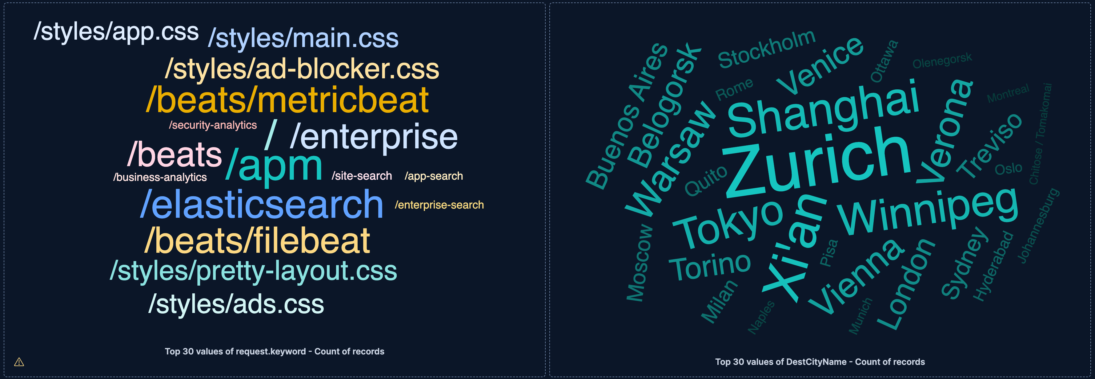
Before you start, make sure you have data indexed into Elasticsearch or install sample data. The point-and-click editor uses data views to access your Elasticsearch data. Data views are usually created automatically when you ingest data. You can also create one manually to select the data that you want.
To build a tag cloud chart:
-
Lens is Kibana's main visualization editor. You can access it:
- From a dashboard: On the Dashboards page, open or create the dashboard where you want to add the visualization, then add a new visualization.
- From the Visualize library page by creating a new visualization.
-
New visualizations often start as Bar charts.
Using the Visualization type dropdown, select Tag cloud.
-
- Select the data view that contains your data.
- Configure the Tags dimension to define which field provides the text labels.
- Configure the Metric dimension to define the value that determines each tag's size.
The chart preview updates to show text labels sized by metric value, with more prominent tags representing higher values.
-
- If you accessed Lens from a dashboard, select Save and return to save the visualization and add it to that dashboard, or select Save to library to add the visualization to the Visualize library and be able to add it to other dashboards later.
- If you accessed Lens from the Visualize library, select Save. A menu opens and lets you add the visualization to a dashboard and to the Visualize library.
Before you start, make sure you have data indexed into Elasticsearch or install sample data. ES|QL queries the indices named in the query directly, so you do not need a data view. The columns returned by the query become available as chart dimensions. Refer to Visualizations using ES|QL queries to learn how to open the editor, shape the query result for a visualization, and save the visualization.
A tag cloud needs a categorical column for its text labels and a numeric metric column to determine their size. In this query, BY returns one row for each request path, COUNT provides its metric value, and SORT and LIMIT retain the 30 most frequent paths:
FROM kibana_sample_data_logs
| STATS requests = COUNT(*) BY request.keyword
| SORT requests DESC
| LIMIT 30
To build the chart:
- Create an ES|QL visualization and run the query.
- Set the visualization type to Tag cloud.
- Assign
request.keywordto Tags andrequeststo Metric. - Customize the chart appearance using the tag cloud chart settings.
- Select Apply and close.
The chart preview shows larger tags for the request paths with more requests.
After building the chart with the point-and-click editor or an ES|QL query, customize its appearance for your data and audience:
- Limit the number of tags
- Keep your tag cloud to 20-50 tags maximum. Too many tags create visual clutter and make the most important terms hard to identify. If the panel is too small to fit all tags, a warning indicates that some values could not be displayed.
- Use meaningful metrics
- Choose a metric that represents importance or frequency. Count is common, but Sum, Average, or custom formulas can provide different insights.
- Consider orientation
- Multiple orientations (horizontal and angled) create visual interest but can make reading harder. Use single orientation for clarity.
- Choose appropriate colors
- Use colors to add meaning (categories) or keep them neutral to focus attention on size differences.
Refer to Tag cloud chart settings for all tag cloud chart configuration options. For panel sizing and layout guidance, refer to Organize dashboard panels.
Customize your tag cloud chart to display exactly the information you need, formatted the way you want.
The Tags dimension defines the text labels that appear in the cloud. For best legibility, display 20 to 50 tags.
- Data
-
The Tags dimension supports the following functions:
- Top values: Show the most common values of a field.
- Field: Select the field to group by. You can add up to 4 fields to create multi-term groups. When multiple fields are selected, each group represents a unique combination of values across those fields. You can reorder the fields by dragging them to change their priority.
- Number of values: How many top values to display. The default number of values depends on your environment:
-
Defaults to 9. -
Defaults to 5 for the first Top values dimension added to the chart and 3 for each additional one.
-
- Rank by: Specifies the dimension the top values are ranked by. Available options:
- Count of records: Rank by the number of documents containing each value. This is the default when a metric is defined.
- Alphabetical: Rank by the term key alphabetically. This is the default when no metric is defined.
- Rarity: Find terms that appear in very few documents, using a rare terms aggregation. You can configure the Max doc count per term to set the maximum number of documents a term can appear in to be considered rare (default: 1, max: 100). Available for single-field terms only, and not for floating-point numeric fields (
float,double,half_float, andscaled_float). - Significance: Find statistically unusual terms compared to the overall data set, using a significant terms aggregation. Only available for
keywordfields and single-field terms. - Custom: Define a custom metric aggregation to rank by (for example, rank by the sum of a numeric field rather than by count).
- Rank direction: Ascending or descending order. Disabled when Rank by is set to Rarity or Significance.
Advanced settingsSeveral advanced options allow you to refine the behavior of the breakdown:
- Include documents without the selected field: Off by default.
- Group remaining values as "Other": On by default.
- Enable accuracy mode: This option improves results for high-cardinality data, but increases the load on the Elasticsearch cluster.
- Include values: Values from the dimension to always include, even if they aren't among the top values. You can enter exact values or a regular expression.
- Exclude values: Values from the dimension to always exclude. You can enter exact values or a regular expression.
- Date histogram: Group data into time-based buckets.
- Field: Select the date field to use for the time-based grouping.
Include empty rows: Include buckets that contain no matching documents. Existing saved visualizations keep their configured setting.
For new visualizations, this option is: - On by default for tables, line charts, and area charts
- Off by default for bar charts, heat maps, pie charts, treemap charts, mosaic charts, waffle charts, metric charts, and tag clouds
When you switch visualization or series type, Lens applies the default for the new type. If you switch back to the visualization type you saved, Lens restores the saved setting.
This option is on by default for all visualization types.
Bind to global time picker: Associate the selected field to the Lens or dashboard main time selector.
Minimum interval: Define the time interval for aggregating the data. For example,
30s,20m,24h,2d,1w,1MDrop partial intervals: Exclude incomplete intervals from the data. This option is off by default.
- Intervals: Create numeric ranges for continuous data by grouping a numeric field into buckets.
- Field: Select the numeric field to create intervals from.
- Intervals granularity: Use the slider to control how many intervals to create. Kibana divides the field into evenly spaced intervals (incremented by 10, 5, or 2) between the field's minimum and maximum values. The minimum granularity is 1, and the maximum is set by the
histogram:maxBarsadvanced setting. - Create custom ranges: Define your own ranges with specific lower and upper bounds and optional labels, instead of using the automatic granularity.
- Include empty rows: Include intervals that contain no matching documents. Existing saved visualizations keep their configured setting.
For new visualizations, this option is: - On by default for tables, line charts, and area charts
- Off by default for bar charts, heat maps, pie charts, treemap charts, mosaic charts, waffle charts, metric charts, and tag clouds
When you switch visualization or series type, Lens applies the default for the new type. If you switch back to the visualization type you saved, Lens restores the saved setting.
This option is on by default for all visualization types.
- Filters: Define custom KQL filters. Each filter creates one group from the documents that match its query.
- Top values: Show the most common values of a field.
- Appearance
-
- Name: Customize the label shown in the visualization title.
- Value format: Control how tag labels are displayed (number, percent, bytes, and more).
- Color mapping: Select a color palette or assign specific colors to tags. Refer to Assign colors to terms for details.
The Metric dimension defines the value that determines each tag's size.
- Data
-
The value that determines tag size. When you drag a field onto the chart, Kibana suggests a function based on the field type. You can use aggregation functions like
Sum,Average,Count,Median, and more, or create custom calculations with formulas.Advanced settingsDepending on the data you defined, several options allow you to apply additional filtering to the data taken into account to compute the final value to show.
Based on the type of visualization you're creating, only some of the following options can be available:
- Normalize by unit: Normalize the metric values to show per unit of time.
- Filter by: Specify a query.
- Reduced time range: Reduce the time range specified on the dashboard's time filter by the specified duration.
- Time shift: Shift the time range by the specified duration. This is useful if the value should use a different time range than the one selected on the dashboard.
- Hide zero values: Don't show values equal to zero. This option is on by default.
- Appearance
-
- Name: Customize the metric label.
- Value format: Control how numeric values are displayed in tooltips.
When creating or editing a visualization, you can customize several appearance options from the Style menu.
- Font size
-
Define the range of font sizes used in the tag cloud:
- Minimum: The smallest font size for low-frequency tags.
- Maximum: The largest font size for high-frequency tags.
- Orientation
-
Define the orientation of the tags:
- Single: All tags are horizontal.
- Right angled: Tags are either horizontal or vertical.
- Multiple: Tags appear at various angles.
- Show label
- Display a label for the tag cloud. The label text is defined by the Name field in the Tags dimension.
The following examples show various configuration options for building impactful tag cloud charts.
- Popular request URLs
-
Visualize the most frequently requested pages on your website:
- Example based on: Kibana Sample Data Logs
- Tags:
request.keyword(Top 30 values) - Metric: Count
- Orientation: Single (horizontal)
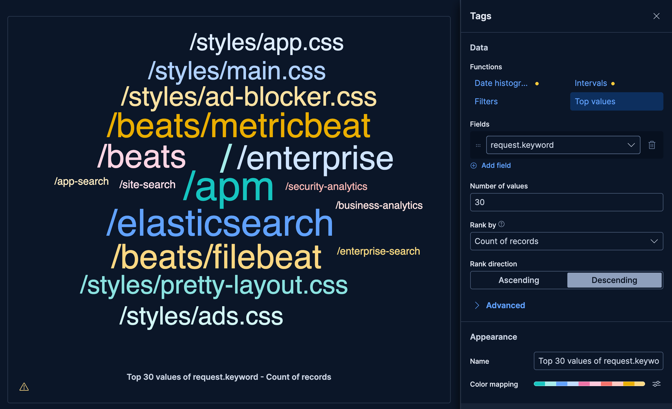
This example creates a tag cloud of the 30 most frequently requested URLs, where tag size reflects how often each URL was accessed.
These API request examples are kept up to date with the latest version of the APIs, so some fields might differ if you're using an earlier version. For a history of breaking changes, refer to the Kibana breaking changes or the Elastic Cloud Serverless breaking changes.
				POST kbn://api/visualizations
					{
  "type": "tag_cloud",
  "title": "Popular request URLs",
  "filters": [],
  "query": { "expression": "" },
  "metric": { "operation": "count", "empty_as_null": true },
  "tag_by": {
    "operation": "terms",
    "fields": ["request.keyword"],
    "limit": 30,
    "rank_by": { "type": "metric", "metric_index": 0, "direction": "desc" },
    "color": { "mode": "categorical", "palette": "default", "mapping": [] }
  },
  "styling": {
    "orientation": "horizontal",
    "font_size": { "min": 18, "max": 72 },
    "caption": { "visible": true }
  },
  "data_source": {
    "type": "data_view_spec",
    "index_pattern": "kibana_sample_data_logs",
    "time_field": "timestamp"
  }
}
request.keywordprovides the text for each tag, showing the full URL path. Tags are ranked by count so the most-visited URLs appear largest.limit: 30displays the top 30 URLs, which is within the recommended range for readable tag clouds.
curl -X POST "${KIBANA_URL}/api/visualizations" \
  -H "Authorization: ApiKey ${API_KEY}" \
  -H "kbn-xsrf: true" \
  -H "Content-Type: application/json" \
  -d '{
  "type": "tag_cloud",
  "title": "Popular request URLs",
  "filters": [],
  "query": { "expression": "" },
  "metric": { "operation": "count", "empty_as_null": true },
  "tag_by": {
    "operation": "terms",
    "fields": ["request.keyword"],
    "limit": 30,
    "rank_by": { "type": "metric", "metric_index": 0, "direction": "desc" },
    "color": { "mode": "categorical", "palette": "default", "mapping": [] }
  },
  "styling": {
    "orientation": "horizontal",
    "font_size": { "min": 18, "max": 72 },
    "caption": { "visible": true }
  },
  "data_source": {
    "type": "data_view_spec",
    "index_pattern": "kibana_sample_data_logs",
    "time_field": "timestamp"
  }
}'
request.keywordprovides the text for each tag, showing the full URL path. Tags are ranked by count so the most-visited URLs appear largest.limit: 30displays the top 30 URLs, which is within the recommended range for readable tag clouds.
For more information, refer to the Visualizations API.
- Most popular flight destinations
-
Show which cities receive the most flights, with larger tags indicating higher traffic:
- Example based on: Kibana Sample Data Flights
- Tags:
DestCityName(Top 30 values) - Metric: Count
- Orientation: Angled
- Color: Gradient
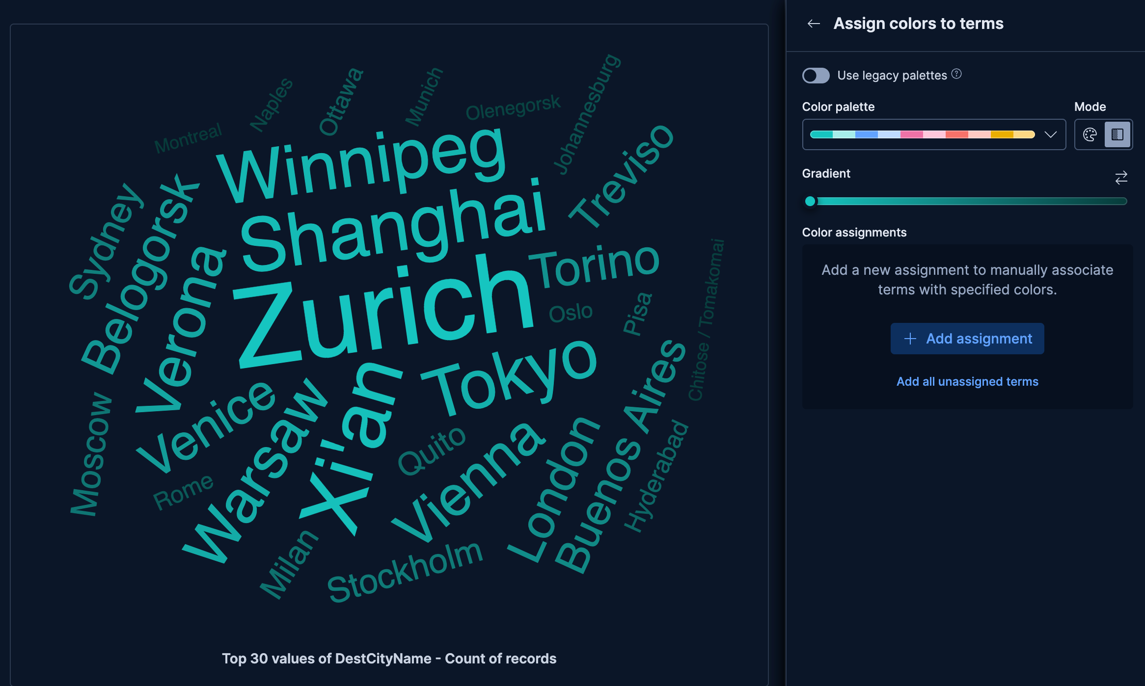
This example creates a tag cloud of destination city names from the flights sample data, with the most popular destinations appearing in larger text.
These API request examples are kept up to date with the latest version of the APIs, so some fields might differ if you're using an earlier version. For a history of breaking changes, refer to the Kibana breaking changes or the Elastic Cloud Serverless breaking changes.
				POST kbn://api/visualizations
					{
  "type": "tag_cloud",
  "title": "Most popular flight destinations",
  "filters": [],
  "query": { "expression": "" },
  "metric": { "operation": "count", "empty_as_null": true },
  "tag_by": {
    "operation": "terms",
    "fields": ["DestCityName"],
    "limit": 30,
    "rank_by": { "type": "metric", "metric_index": 0, "direction": "desc" },
    "color": {
      "mode": "gradient",
      "palette": "default",
      "mapping": [],
      "sort": "desc",
      "gradient": [{ "type": "from_palette", "palette": "default", "index": 0 }]
    }
  },
  "styling": {
    "orientation": "angled",
    "font_size": { "min": 18, "max": 112 },
    "caption": { "visible": true }
  },
  "data_source": {
    "type": "data_view_spec",
    "index_pattern": "kibana_sample_data_flights",
    "time_field": "timestamp"
  }
}
DestCityNameprovides human-readable city names as tag labels, sized by flight count so the busiest destinations appear largest.- The
gradientcolor mode withsort: "desc"applies the palette spectrum from the most to the least popular city, reinforcing the frequency ranking with color intensity. orientation: "angled"allows tags to appear at multiple angles, making better use of space when many cities compete for room.
curl -X POST "${KIBANA_URL}/api/visualizations" \
  -H "Authorization: ApiKey ${API_KEY}" \
  -H "kbn-xsrf: true" \
  -H "Content-Type: application/json" \
  -d '{
  "type": "tag_cloud",
  "title": "Most popular flight destinations",
  "filters": [],
  "query": { "expression": "" },
  "metric": { "operation": "count", "empty_as_null": true },
  "tag_by": {
    "operation": "terms",
    "fields": ["DestCityName"],
    "limit": 30,
    "rank_by": { "type": "metric", "metric_index": 0, "direction": "desc" },
    "color": {
      "mode": "gradient",
      "palette": "default",
      "mapping": [],
      "sort": "desc",
      "gradient": [{ "type": "from_palette", "palette": "default", "index": 0 }]
    }
  },
  "styling": {
    "orientation": "angled",
    "font_size": { "min": 18, "max": 112 },
    "caption": { "visible": true }
  },
  "data_source": {
    "type": "data_view_spec",
    "index_pattern": "kibana_sample_data_flights",
    "time_field": "timestamp"
  }
}'
DestCityNameprovides human-readable city names as tag labels, sized by flight count so the busiest destinations appear largest.- The
gradientcolor mode withsort: "desc"applies the palette spectrum from the most to the least popular city, reinforcing the frequency ranking with color intensity. orientation: "angled"allows tags to appear at multiple angles, making better use of space when many cities compete for room.
For more information, refer to the Visualizations API.